
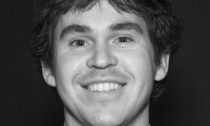
It might have a smaller fan-base than a Parris Goebel dance routine or a Taika Waititi movie, but a New Zealander is taking a product to the masses that he hopes will go down just as easily.
John Lang has just finished an unenviable task: taking a jargon-packed, number-heavy report by the Intergovernmental Panel on Climate Change and turning it into a graphic the average person might read.
The result is Worlds Apart, which leads people through three alternative futures, depending on how fast governments tackle emissions and how the planet responds. The visuals feature filling bathtubs, open doors, and an archer with a bow and arrow demonstrating humanity overshooting 1.5 degrees C of heating – or not.
While there is no single forecast that can say how a hotter world will look, the IPCC asked Lang to show people three plausible possibilities: early, effective action; delayed, decisive action and late, uncoordinated action.
On the first prong of the pick-a-path, people quickly slash food waste, electric cars overtake petrol ones by 2025 and carbon capture and storage plants come online and start pulling carbon dioxide from the atmosphere.
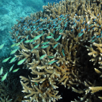
Thanks to this positive mix of events, people save the Amazon rainforests, crop yields are stable, coral reefs partly recover after a dieback and most island states and coastal communities persist – although the tropics suffer frequent heat waves.
On the second path, the world overshoots 1.5C, but people manage to bring it back. Public unrest following deadly heat waves in Chicago, Kolkata, Beijing and Sao Paolo forces a sudden move towards much more ambitious greenhouse gas targets.
Disruptive technology helps cut emissions, but nations don’t strongly use economic measures to drive clean energy, making the shift expensive.
Because the world stays at 2C higher temperatures for several decades, it suffers severely damaged tropical forests, falling crop yields and coral reefs are eliminated.
On the third path, global warming reaches 1.5C in 2030 and support for the Paris agreement wanes. No major policy changes happen, and by 2100 the planet is 3C hotter – and unrecognisable.
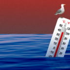
An El Nino/La Niña phase kicks off several catastrophic years, followed by major heat waves on all continents. A hurricane and high storm surge destroys a large part of Miami and crops are decimated in the US great plains, southern Australia, Russia and Eastern Europe.
Food prices rise, life expectancy falls and people from several small island states have to seek refuge elsewhere, as do refugees from major conflicts sparked by climate disruption.
Even on this path, massive investment in renewable energy happens eventually, but the efforts are smaller and less uncoordinated.
For Lang, the take-home message was that we can claw the world back from over-heating – but the longer things stay hot, the bigger the burden on society.
“I think it’s still not brilliantly understood that actually, even if we do cross 1.5C, which is obviously very, very likely, extremely likely… we can return. So even as we approach 1.5 degrees, we don’t (have to) give up on that target. But also (I was) trying to portray the burden… (and) show that the burden is going to on fall on future generations.”
Lang never intended to get into design, much less making graphs about climate change.
In a sense, the inspiration for his career was his stepfather – former National Party Cabinet Minister Sir Lockwood Smith.
Lang got passionate about understanding and explaining climate change from long conversations with Smith, who was sceptical about some climate science.
At the time, Smith was New Zealand’s High Commissioner to the United Kingdom and Lang was a student.
Lang started reading: Naomi Oreskes’ Merchants of Doubt, the Weather Makers by Tim Flannery and studies on psychology and climate change.
That inspired him to do his Masters in environmental law and policy.
Now he works for the non-profit Energy & Climate Intelligence Unit in London for much of the week, runs a blog called the the e-nvironmentalist and spends any spare work time researching climate trends.
The IPCC discovered him in 2019 when – just for the satisfaction of it – he made a graphic showing the main points of the IPCC’s special report on ice and oceans.
“I spent four days doing an infographic. Everyone was like, what are you doing? What are you up to Lang?”
“And I said, I’m just doing something, I’ll show you in a few days!”
The graphic landed well. Lang showed it to people at the European Climate Foundation, who helped him publish it. UK scientists involved with the IPCC saw it and passed it on to the organisation’s head of communications. Then the IPCC’s media people got in touch via Twitter and asked Lang to visualise a piece of the organisation’s influential special report on 1.5C, showing various futures.
The IPCC is famously careful with its communications, which posed some challenges for graphic-making Phrases such as ‘pipedream’ or the size of a tap running into bathtub had to pass approval to make sure they were as scientifically-accurate as possible.
The resulting graphic was released this week, marking two years since the 1.5C report was published.
Lang’s other recent projects including running a net zero tracker, using bricks to show why Covid-19 hasn’t really slowed emissions, and presenting the 2019 Rugby World Cup league tables as contest of per-capita emissions.

Social Profiles